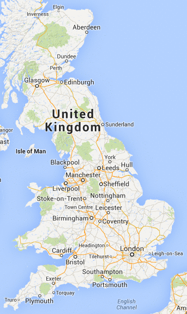
Do you remember last post, when I was complaining about Google Maps deciding that Tilehurst and Headington were more important places to mark on a map of the UK than Oxford and Reading?
The good news is that although it still does this, it is now no longer the stupidest thing on the map!
You see that thing just between Stoke and Birmingham, called "Town Centre".
That's the most stupid thing on the map. By far. Not just because it's Telford (although I'd question the wisdom of putting Telford on the map), but because it just says "Town Centre". No context. And then when you zoom in it just disappears.
The thing is, this used to work, back when Google Maps launched. It's not that difficult. OpenStreetMap do a much better job. If I look at the equivalent zoom level there I see it has a slightly eccentric choice of what settlements to show (it picks those that are ceremonially cities, so you get Ely but no Reading, for example), but at least that's consistent and defensible. Nobody chose Tilehurst, or "Town Centre". They just didn't check the output of the algorithm before they went live. People use Google Maps for directions. People rely on it. Is it really safe?