Thursday 11 July 2013

It's Getting Blending by the Sea

There are new tiles!

They still have "Town Centre" and "Leigh-on-Sea" (a made-up place name if ever I saw one).

And the motorway colours are wrong. It's a well established principle of UK mapping that Motorways are blue. I was glad when Google Maps decided to accept this. Now they've changed their mind... Presumably so that they only have one stylesheet for the entire world? At least with motorways it's obvious what's happened. With the Primary Route Network, A-roads and B-roads I have no idea. Is there a key? Hahaha.

But the sea's got a nice gradient to it now, so it's not all bad.

Sunday 7 July 2013

"Town Centre"

Do you remember last post, when I was complaining about Google Maps deciding that Tilehurst and Headington were more important places to mark on a map of the UK than Oxford and Reading?

The good news is that although it still does this, it is now no longer the stupidest thing on the map!

You see that thing just between Stoke and Birmingham, called "Town Centre".

That's the most stupid thing on the map. By far. Not just because it's Telford (although I'd question the wisdom of putting Telford on the map), but because it just says "Town Centre". No context. And then when you zoom in it just disappears.

The thing is, this used to work, back when Google Maps launched. It's not that difficult. OpenStreetMap do a much better job. If I look at the equivalent zoom level there I see it has a slightly eccentric choice of what settlements to show (it picks those that are ceremonially cities, so you get Ely but no Reading, for example), but at least that's consistent and defensible. Nobody chose Tilehurst, or "Town Centre". They just didn't check the output of the algorithm before they went live. People use Google Maps for directions. People rely on it. Is it really safe?

Thursday 28 March 2013

University of Headington

Lots of new features since we posted last. The most visible is perhaps the layouts of malls, as demonstrated here with the One New Change development, grimly ironically situated next to St Paul's.

It looks quite spiffy, doesn't it? It's good that they have got to this level of fine detail because it means they have finally sorted out more basic levels of general data quality issues?

What's that you say?

You're fairly sure that Headington and Leigh-on-Sea shouldn't be on this map; and wouldn't Oxford and Southend would be more worthy of captioning at this zoom level?

And you're not sure about whether the Yorkshire Dales should be labelled at all, but if they do it probably shouldn't be as the "Yorkshire Dales National Park Authority" but the "Yorkshire Dales", for crying out loud does anyone do any QA on these at all before pushing them live this is seriously going to damage Google's fast-diminishing reputation if it keeps up? Sorry, you seem to have got into a bit of a stream of a consciousness babble there. But I get that you're unhappy. Tell you what, why don't you wait until the next set of tile revisions, in a couple of months. I'm sure it will be all fixed then!

Sunday 1 July 2012

I don't know why it's labelled with five

There are new tiles!

Firstly, let's compare the overall map of Britain and Ireland.

Changes in this are: the labelling of Glasgow (good), the replacement of a caption for Sheffield with Liverpool (fair enough), and the removal of a good chunk of the A1 road between Belfast and Dublin (less good). At the next zoom level I challenged the place name algorithm's decision to label Leap but not Norwich. They've decided to split the difference by labelling both Leap and Norwich.

If we zoom in to the Euston Road, we find all the minor defects I discovered in May continue to be present. There are two major changes. Firstly, the Midland Road has stopped being a B-road and started being unclassified. This is probably long-overdue. Secondly, the caption for St Pancras Parish Church has been replaced with one for the "Hotel Ibis London Euston St Pancras". This seems to be completely unhelpful, and could leads to all sorts of confusion vis a vis the actual St Pancras station, which is still not marked as a tube.

Back out again and looking at north-east London, we have the addition of a caption for "Brownswood Park", which at least exists, but still nothing for Hackney, Tottenham or Leyton. Another change is the downgrading of Camden Road from a "green" A-road to an orange one - indicating that it is no longer part of the Primary Route Network.

And finally, in the category of Weird Things, Harrods is labelled "5". I don't know why it's labelled with five. Perhaps she'll die. You can't click on it, and there's nothing obvious when you search for "5" and Harrods. Any guesses?

Thursday 10 May 2012

Google Maps recently posted some new tiles. These seem to be generally an improvement over the previous, rather poor, set of tiles. Let's look at how these appear in the United Kingdom, and specifically London.

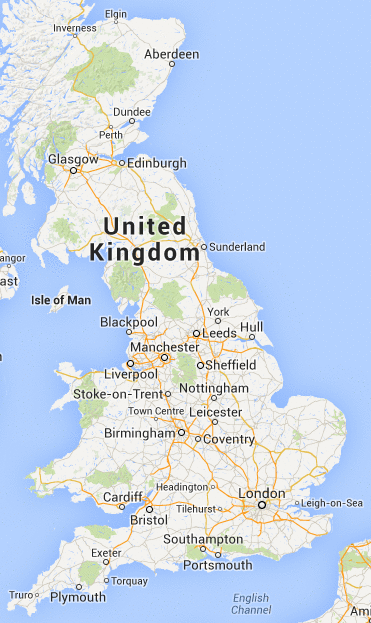
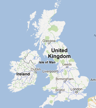
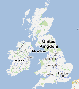
The most obvious feature here at the UK-wide level is the much bolder country name caption. This appears to be dependent upon the size of the country now, with the UK's text being much larger than Ireland's, which is a slightly unfortunate effect.

The choice of cities to caption at this level is much better than it has been sometimes - London, Bristol, Birmingham, Sheffield and Leeds are all fairly substantial places. There's no accounting for the absence of Glasgow or Edinburgh, though.

The next zoom level is particularly odd in Ireland, as demonstrated by the appearance of Leap, a village with a population of 240. Why Leap is more important than Norwich is left as an exercise to the reader.

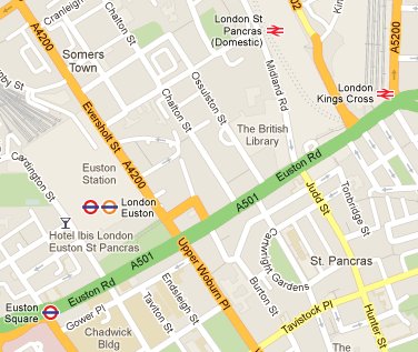
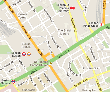
Moving in to London we see the Euston Road area. In the last set of tiles Euston station wasn't marked at all other than as a building - it has now re-acquired the Underground and Overground icons, although still no National Rail sign. It has a natty double-caption. Meanwhile, further to the east, there's no tube shown at Kings Cross St Pancras, and St Pancras is only indicated by the Domestic name, with no mention of St Pancras International.

The stations are clickable, although for some reason the Euston icon doesn't give access to the live Victoria/Northern line data that Warren Street (just off the side) does. The only other hyperlinked thing in this view is St Pancras Church, which is correctly placed and links to the appropriate website.

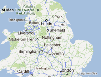
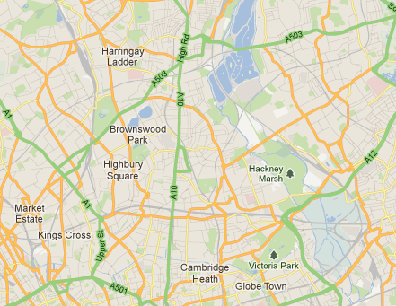
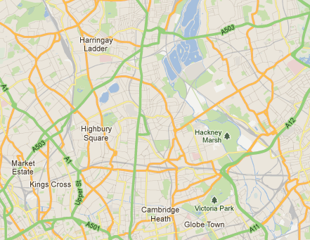
Zooming out a bit, we see in North East London the continuing bizarre collection of captions. At this level you'd expect to see names of well-known town centres in London - Hackney, Tottenham, Wood Green, Walthamstow, and suchforth. None of that here - instead we have names of parks and other open spaces, and informal names of areas such as "Harringay Ladder" (which refers to the rung-like roads in Harringay between Green Lanes and Wightman Road). The town centre labels do appear eventually - three zoom levels in.

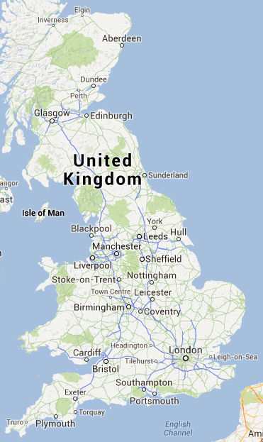
So, in summary, these tiles appear to have fixed some of the sillier issues with things like missing stations, but still are making weird decisions about what to caption. At least one long-standing data bug (the name of the southern part of Wardour Street) has been fixed, and I've not noticed any regressions yet. A nice touch, that I think is new, is the addition of boat routes on the Thames.

Tuesday 10 April 2012

Google Maps has decided to randomly rename lots of railway stations in London after nearby bus stops. We also have a bonus triplication of the caption for New Cross station!

Thursday 15 December 2011

Google Maps has got a new tileset since I last noticed. Obvious defects in areas I am familiar with.
  • London omitted at Z5 in favour of Reading
  • placenames in London that appear at Z11 disappear at Z12. The placenames on Z12 are a strange set, mostly the larger parks ("Hackney Marsh", "Victoria Park", but no Hackney, for example), but also "Harringay Ladder", which is a name I've never seen on a map before, and particularly oddly "The London Wetland Centre (The Wildfowl and Wetlands Trust)".
  • There's a "Dodgy Park" that has appeared just west of East Ferry Road on the Isle of Dogs, which seems to be some sort of nickname
  • Walthamstow Village is captioned "Upper Walthamstow", entirely the wrong place
  • the part of Wardour Street south of Shaftesbury Avenue is still labelled "Whitcomb Street", five years on and counting.
  • Knightsbridge label applied to an area west of Exhibition Road

There's a new render style, too - which means that the railways look weird when bunched together at Z13 particularly and closer, e.g. around Stonebridge Park or the approaches to Kings Cross St Pancras.

But hey, at least the M25 is no longer labelled as an "Autoroute britannique", and it doesn't think the A329 through Reading is a motorway any more.

I don't know what exactly is going on here, but from the outside it appears Google Maps has been generally getting poorer with time. Absurdly poorer. I can only assume they don't test with London. Or possibly at all.